Bind Data to the Components
Objectives
In this lab, you will learn how to:
-
Bind data to the components
-
Bind events to the components
-
Binding data to Components
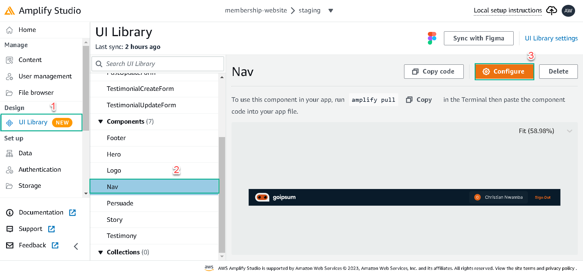
To breathe life into the components, we’ll be binding data and events to them in the Amplify Studio. We’ll start with the Nav component.
Click on the UI Library tab, click on the Nav and click on configure button to bind data and events to the Nav component.
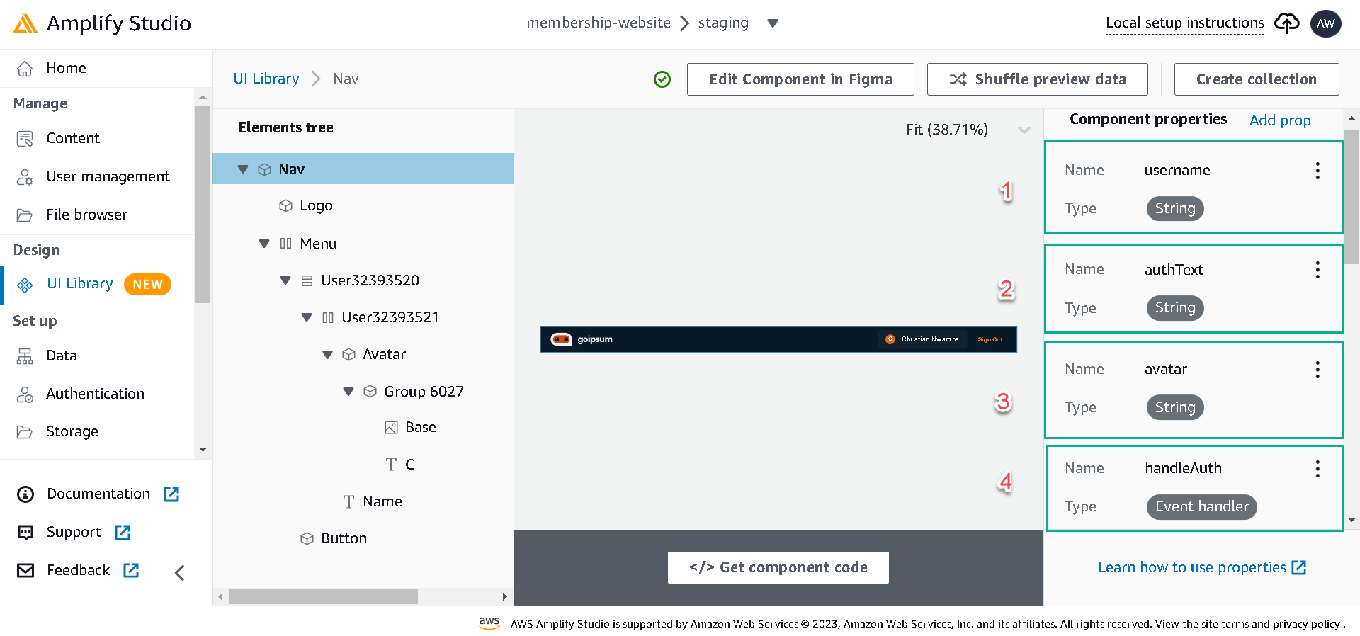
Next, in configure dialog, click on the component’s root (Nav) and click Add prop. We’ll create the following top-level props and consume them in the elements with the Nav component.
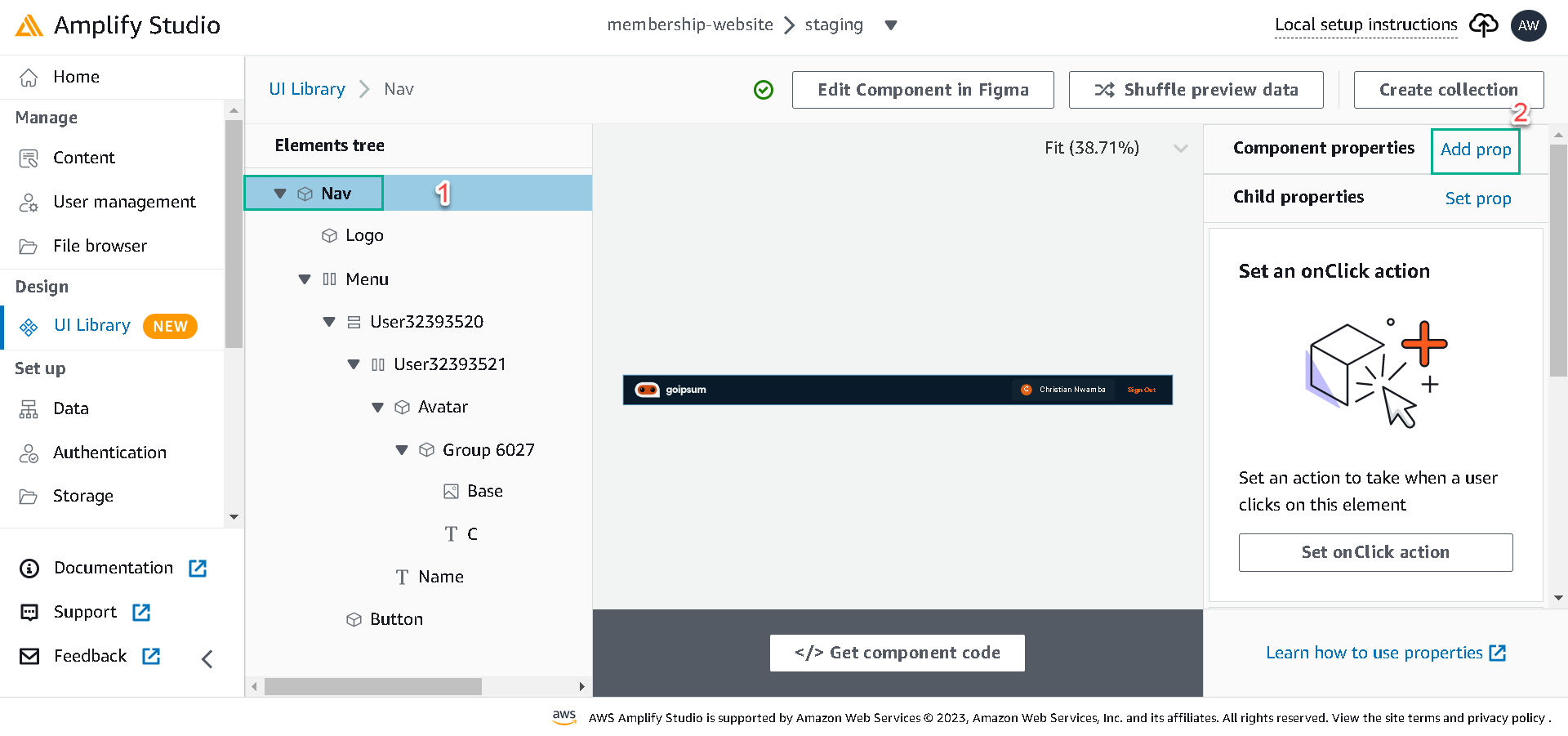
-
username: this prop will receive the user names on the website.
-
authText: this prop will display the sign-in or sign-out buttons depending on the user authorization.
-
avatar: this will handle the user avatar.
-
handleAuth: this will handle the authorization event.
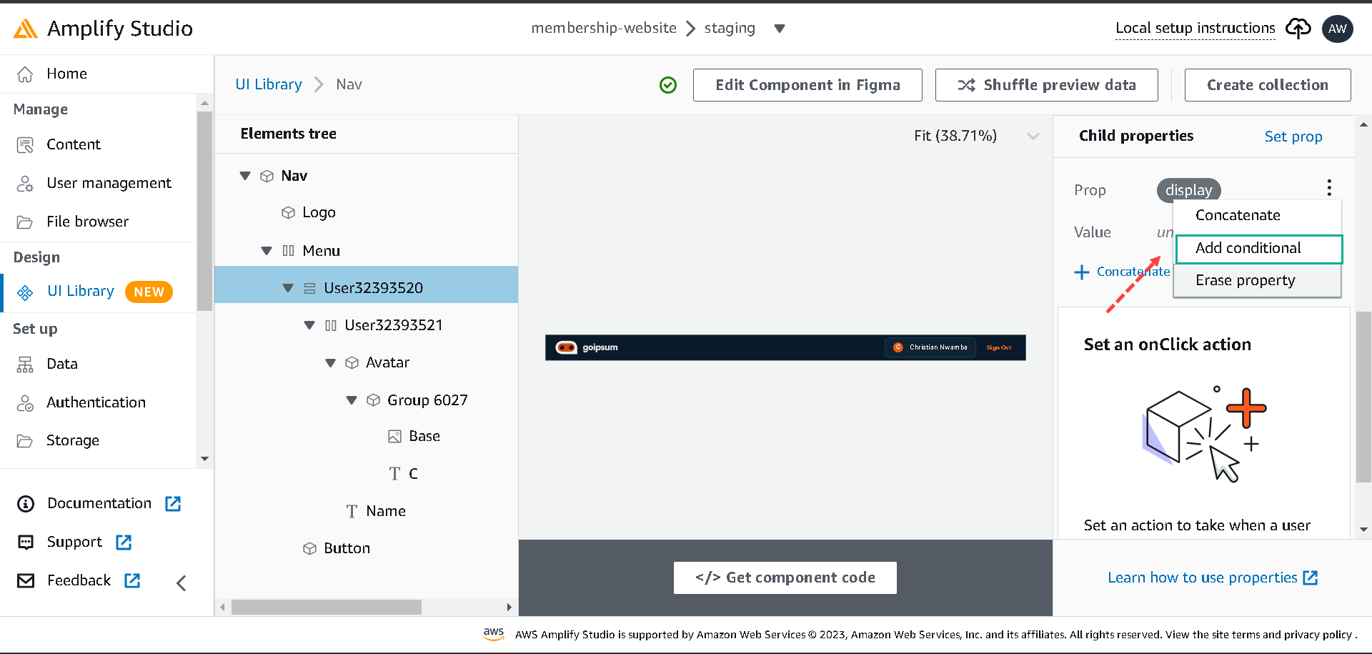
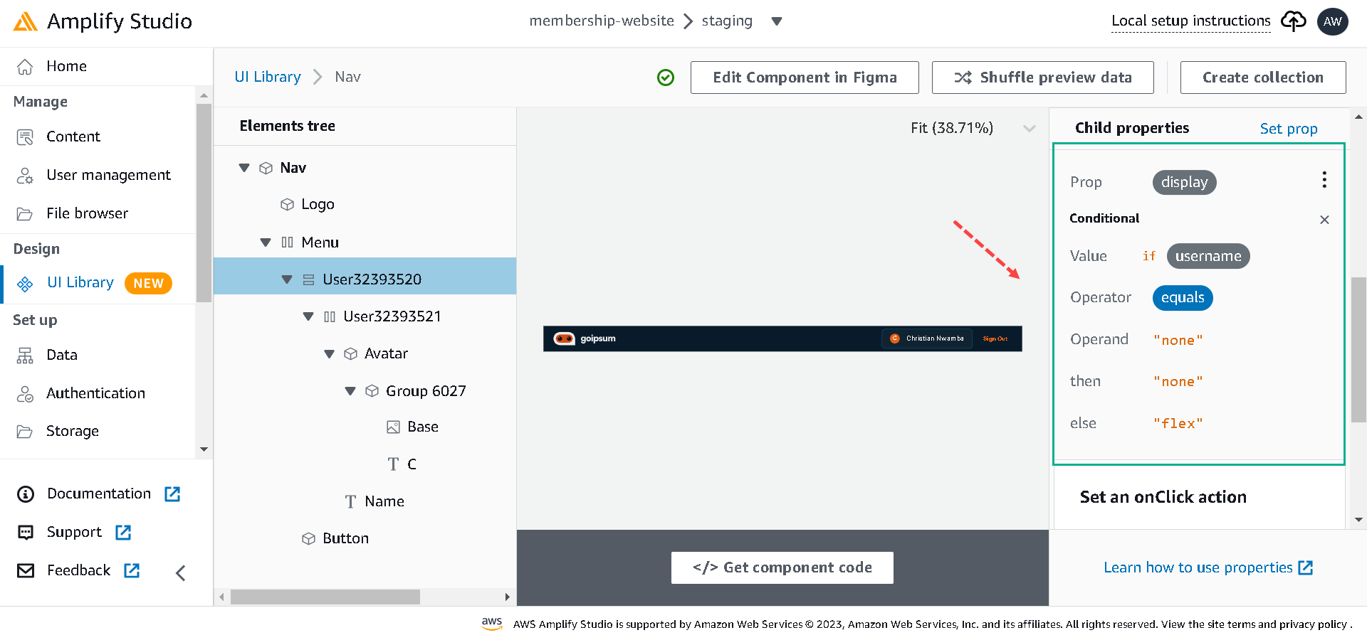
In the Nav component, we want to hide the username if there’s no user, so select the user element and click on the Set prop button; beside the child properties.
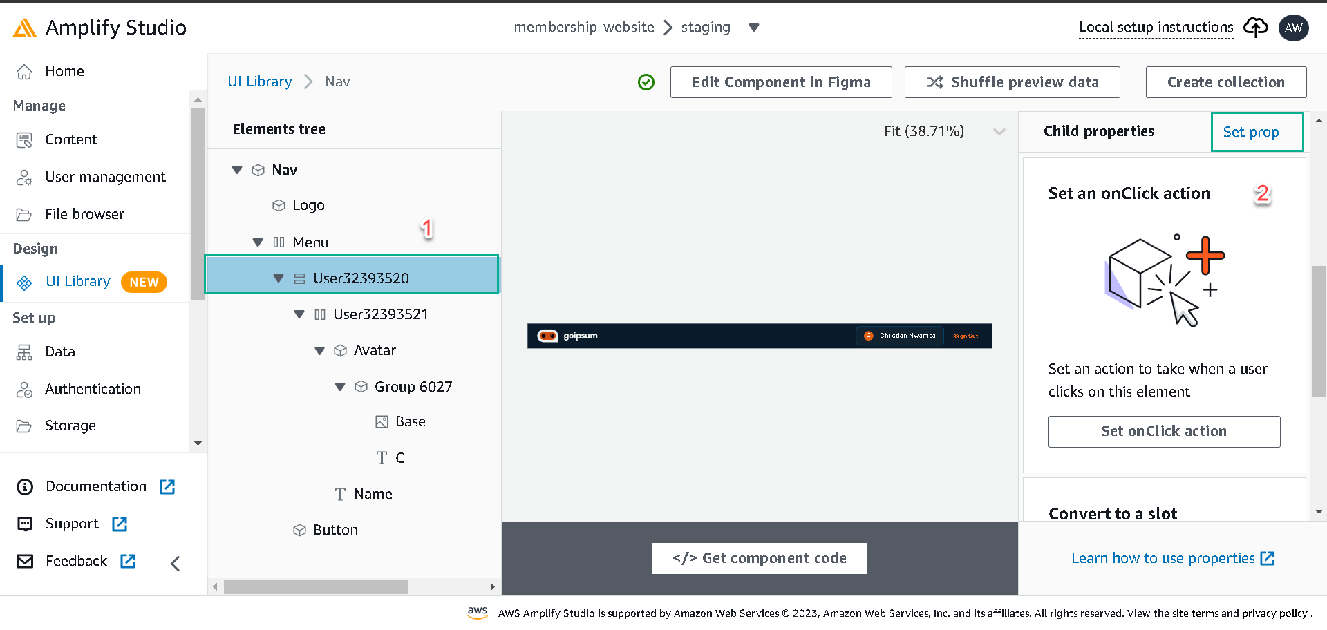
Select a display from the list of props, click on the three vertical dots beside it, click on add conditional and add conditions like in the below:
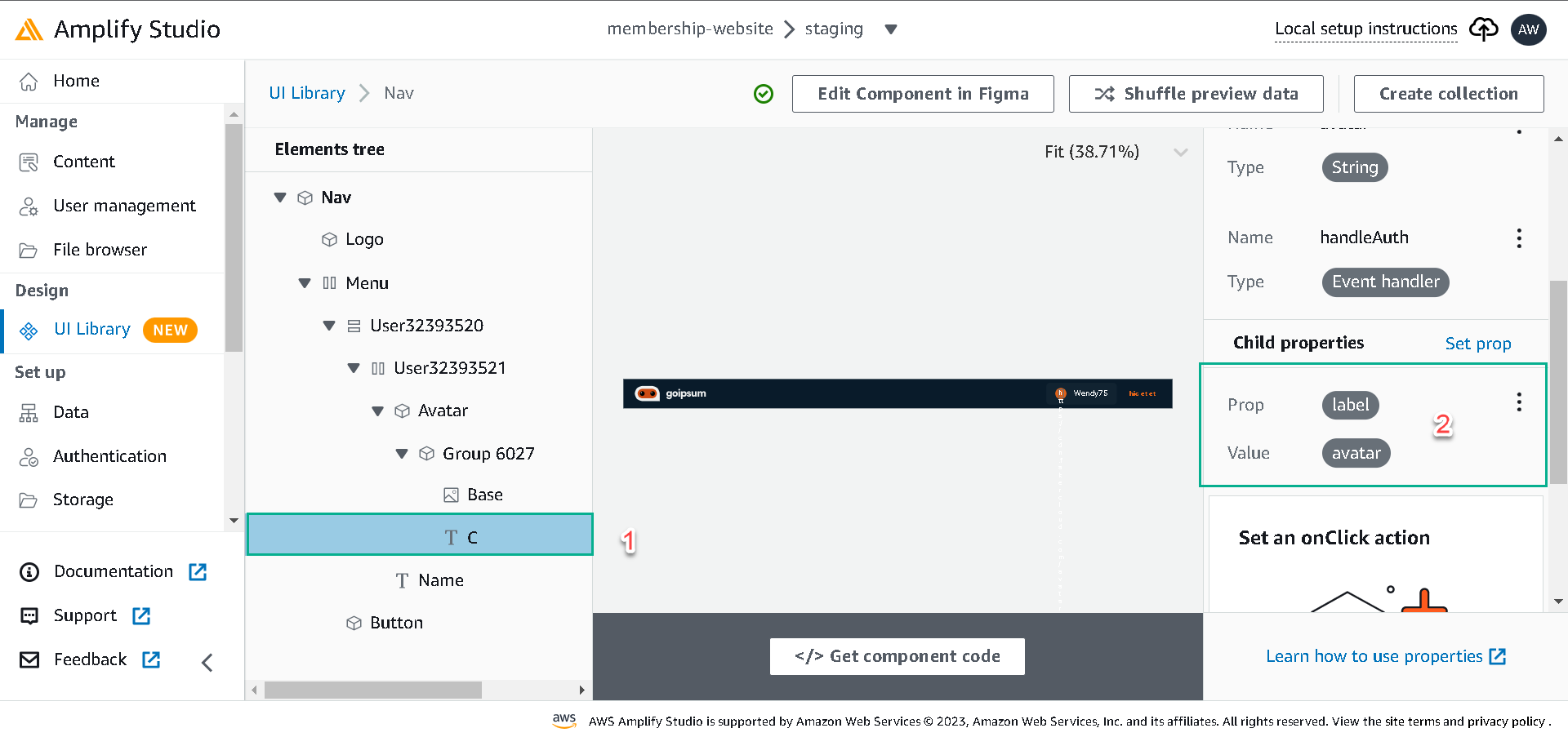
For the avatar text, select it, click on the Set text label button and set the label to the avatar, and for the user name, select it and set its label to the username.
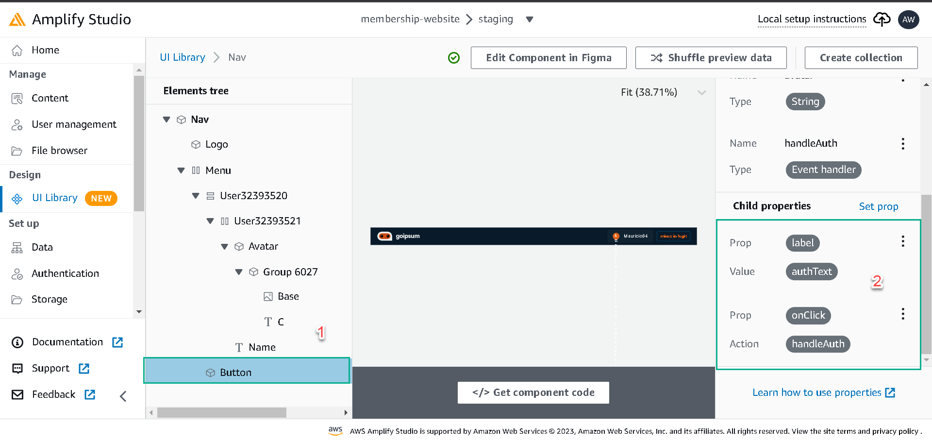
For the button, select it, click on Set an onClick action, select the onClick prop and set its value to handleAuth. Also, click on Set prop, select label prop, and set the value to authText.
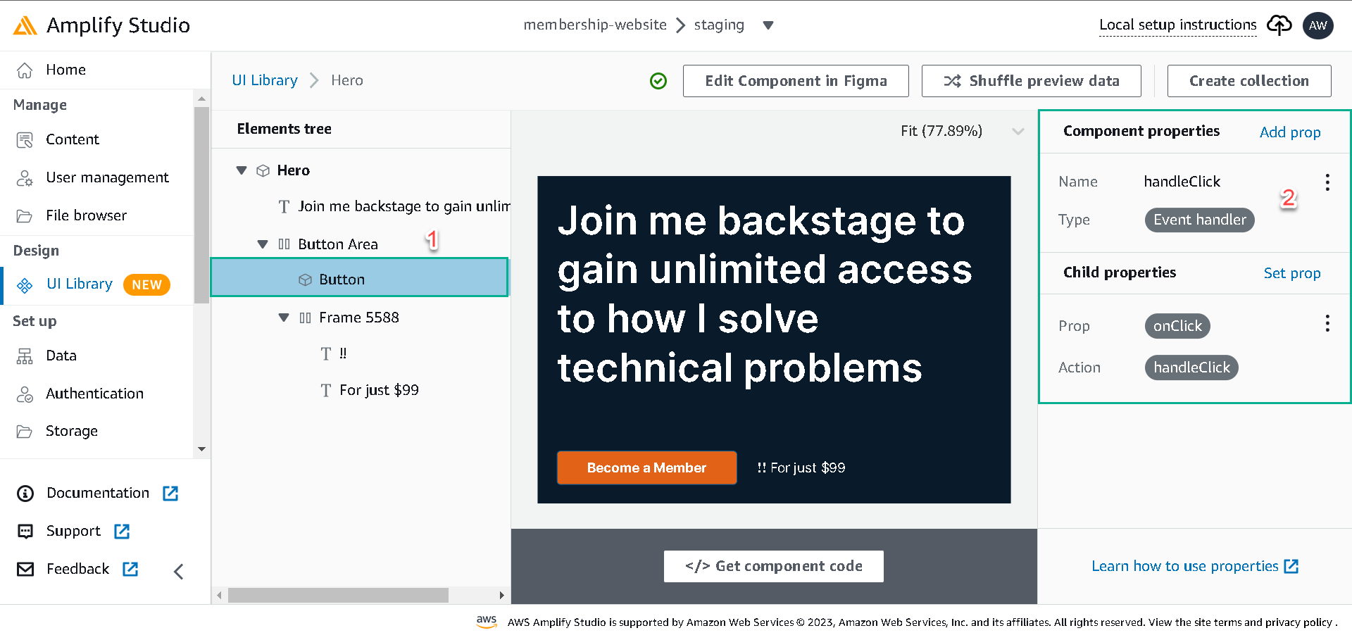
For the Hero component, we’ll create a top-level prop handleClick and set its type to an Event handler. Select the Button element and set its onClick prop to the handleClick we created above.
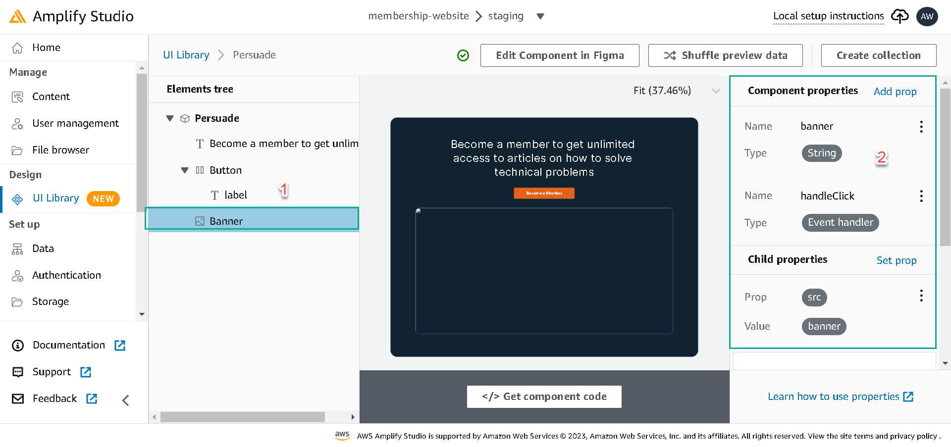
We’ll create two top-level props for the Persuade component, handleClick, and banner, then set their types to the Event handler and String.
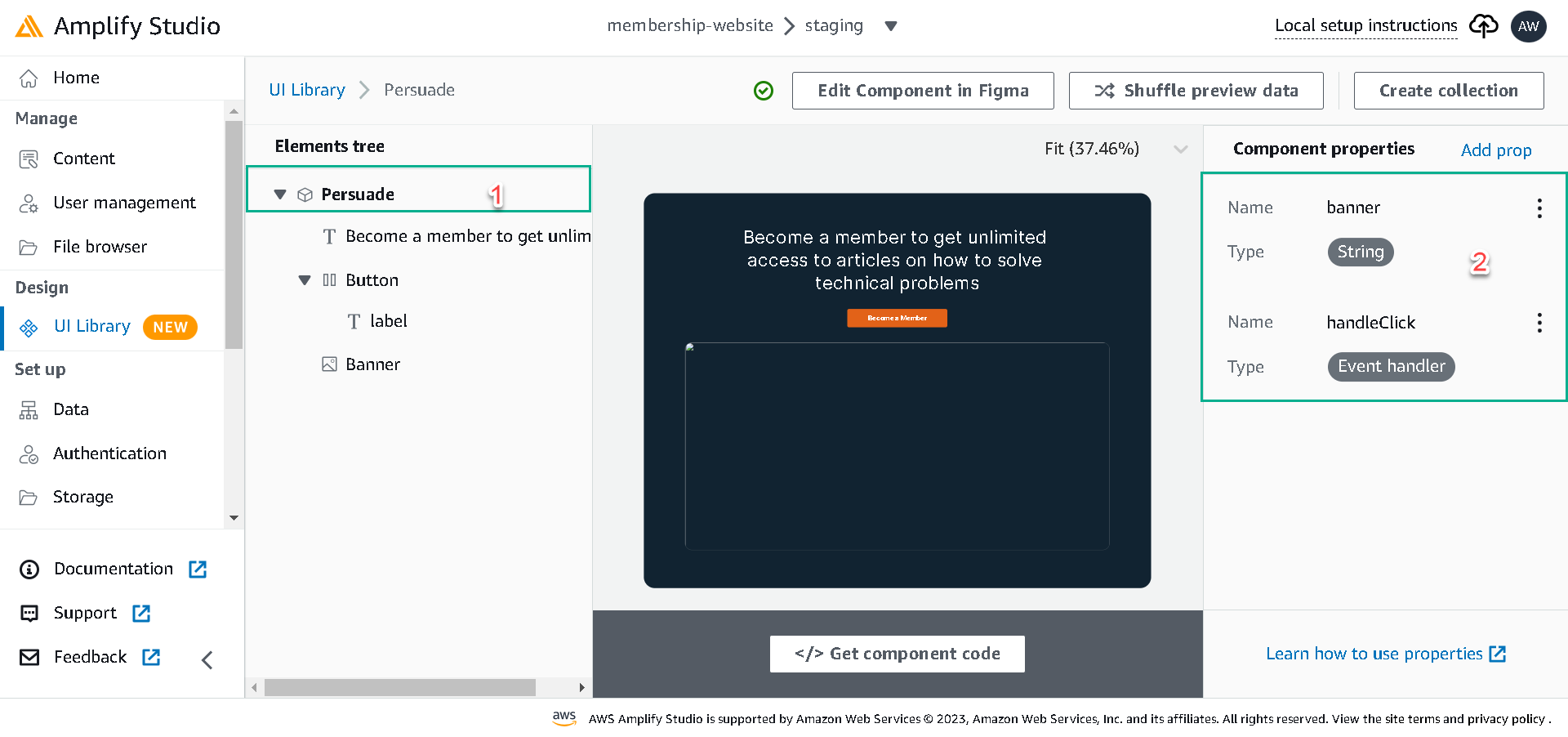
Next, select the Button element, select the onClick prop and set it to the handleClick we created. Select the Banner element, select the src prop and set it to the banner prop we created.
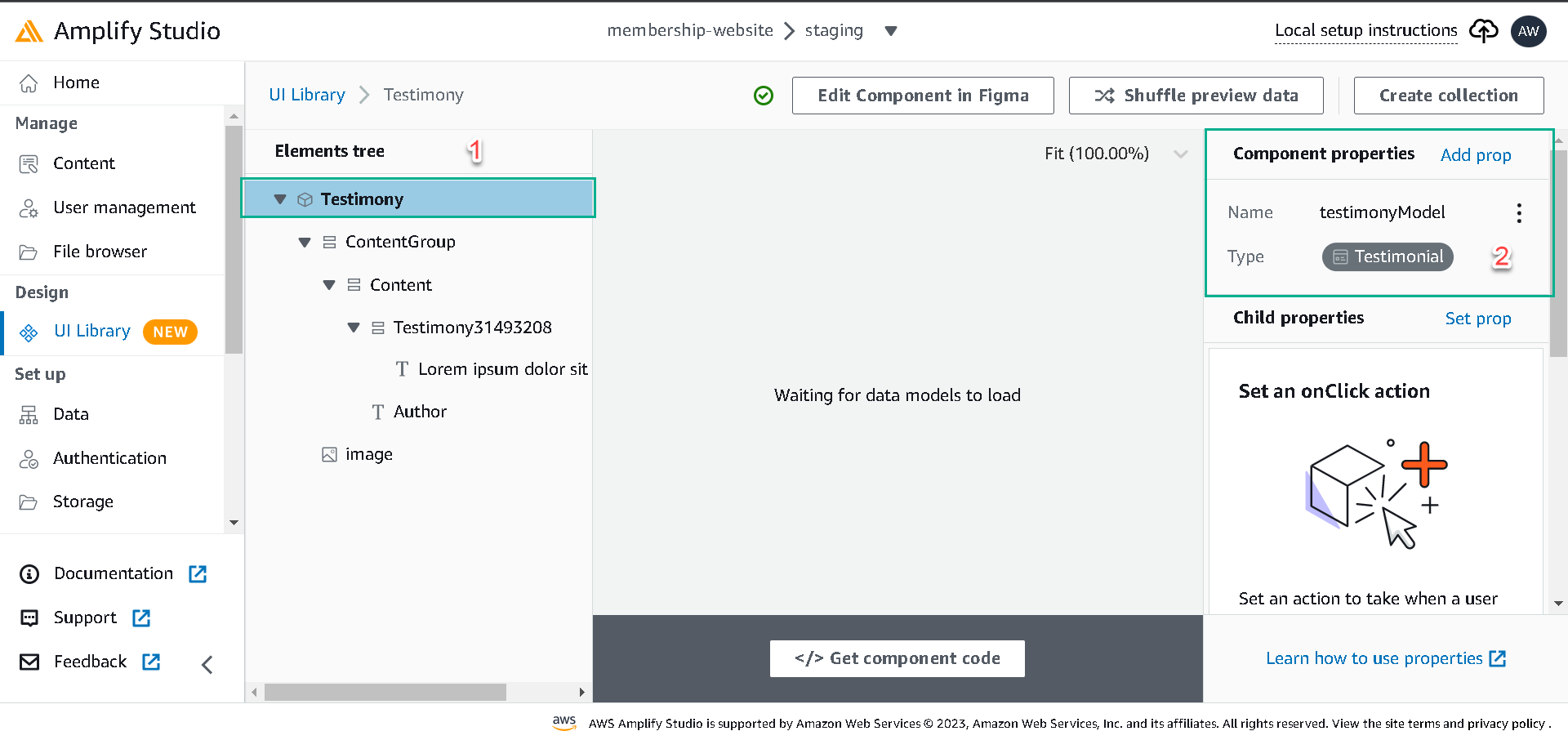
For the Testimony component, we’ll bind data a bit differently; unlike the earlier components, we’ll be binding data provisioned in our database to the Testimony component.
Click on the Testimony Component and click on configure, select the Component’s root and click on Add prop, Create a top-level prop testimonyModel, and set its type to Testimonial data model. All the elements of the Testimony Component will have access to the rows in the Testimonial table.
Now, let’s set the Testimony Component elements to different rows of the Testimonial data model.
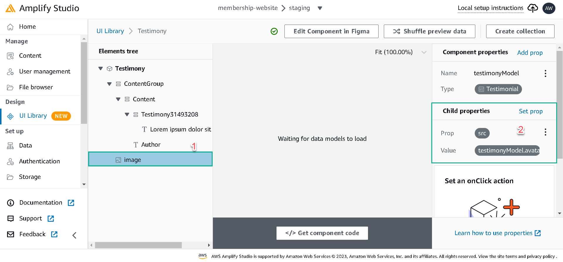
- Select the image element, click on Set prop, select the src prop and set it to testimonyModel.avatar.
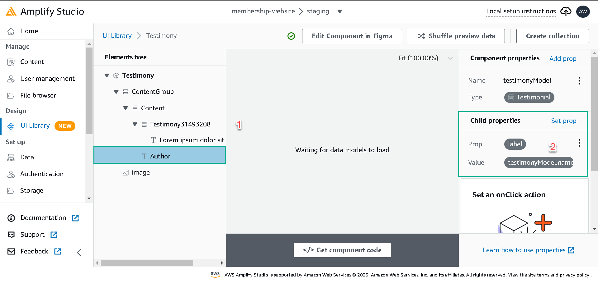
- Select the Author element, click on Set prop, select the label prop and set it to testimonyModel.name.
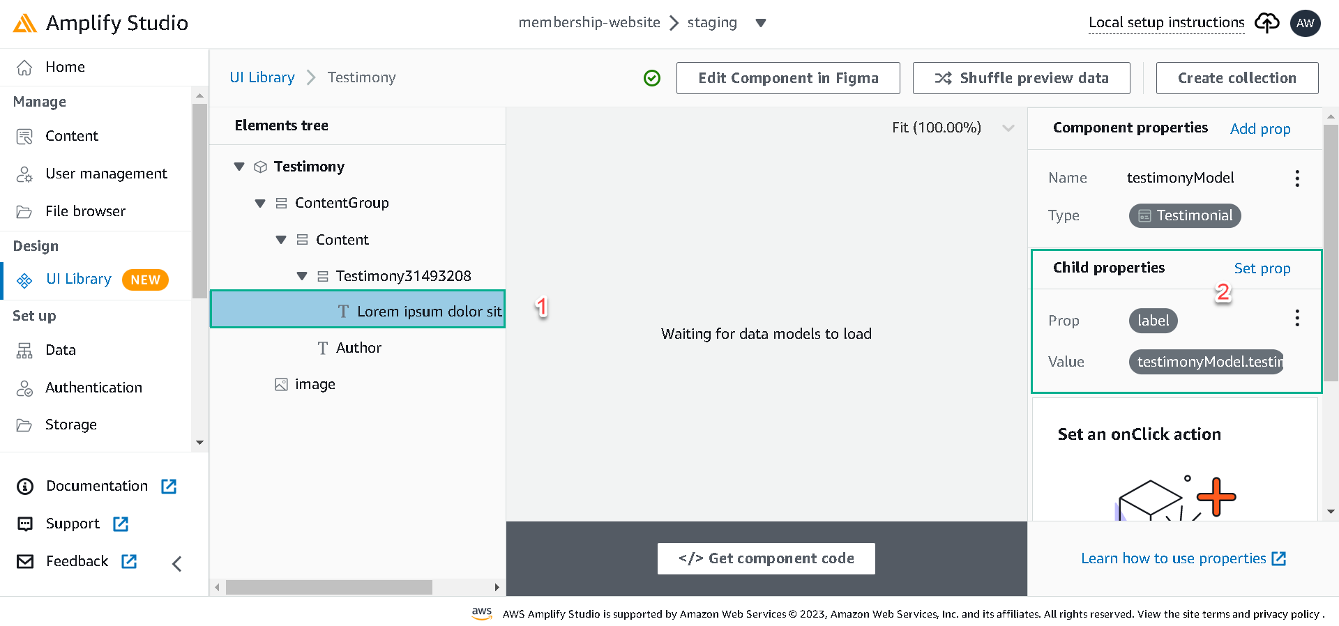
- Select the Testimony text element, click on Set prop, select the label prop and set it to testimonyModel.testimony.
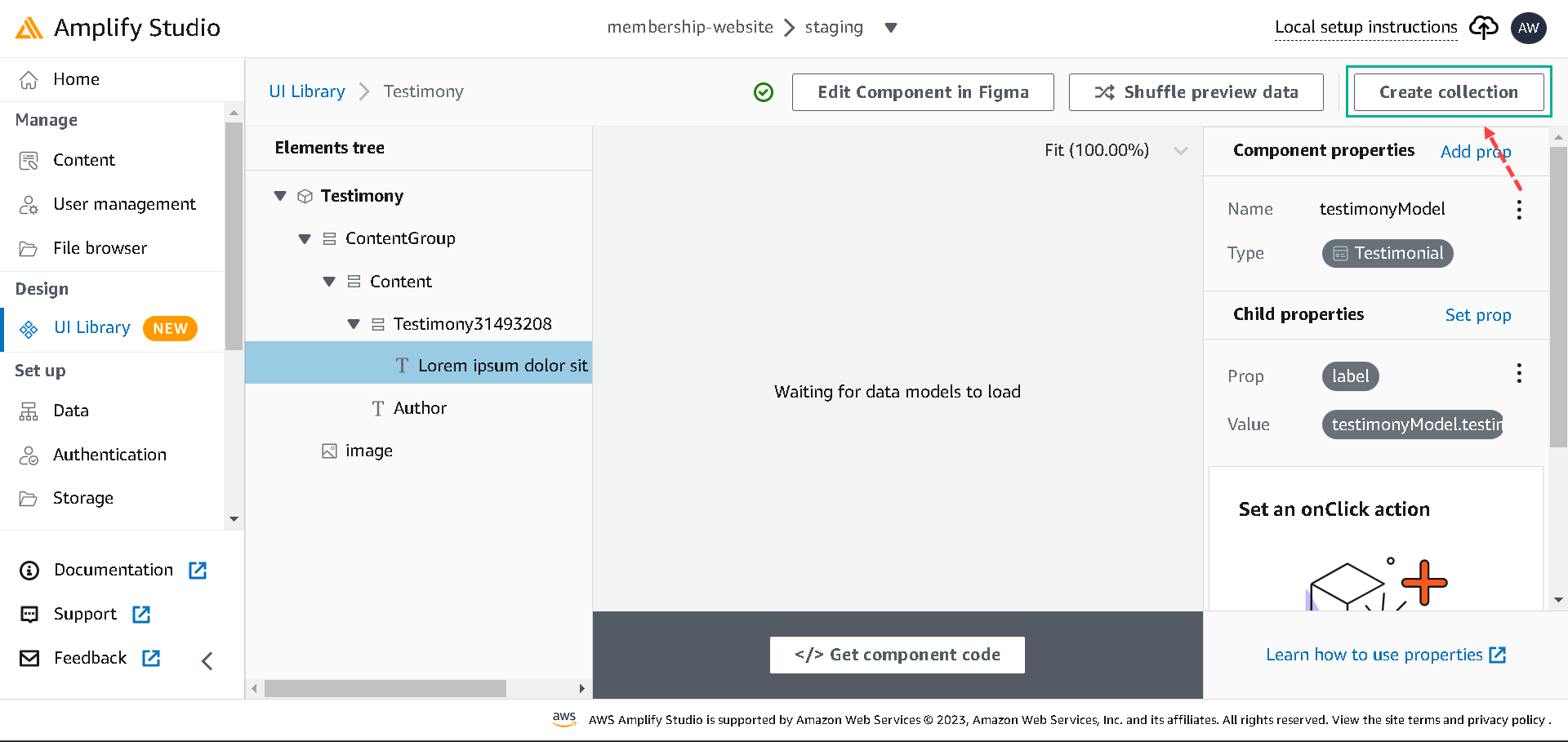
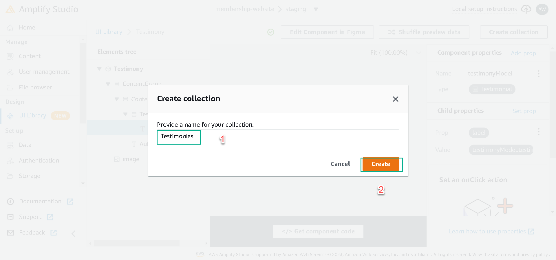
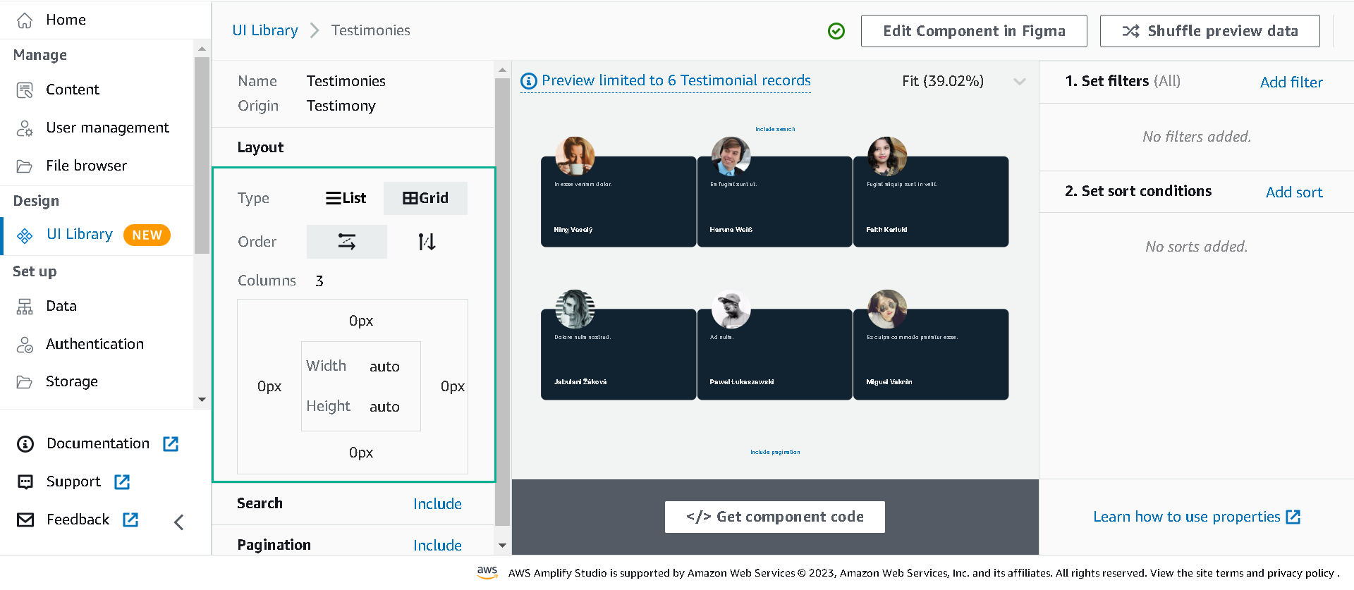
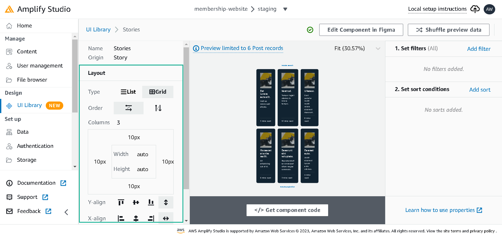
Next, click on Create collection to generate cards for the total number of records in the Testimonial data table. Change the display to Grid on the collection page and set the column to three.
Next, navigate back to UI Library; let’s repeat the process for the Story Component just like we did for the Testimony Component.
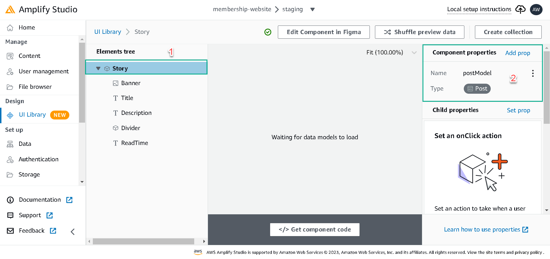
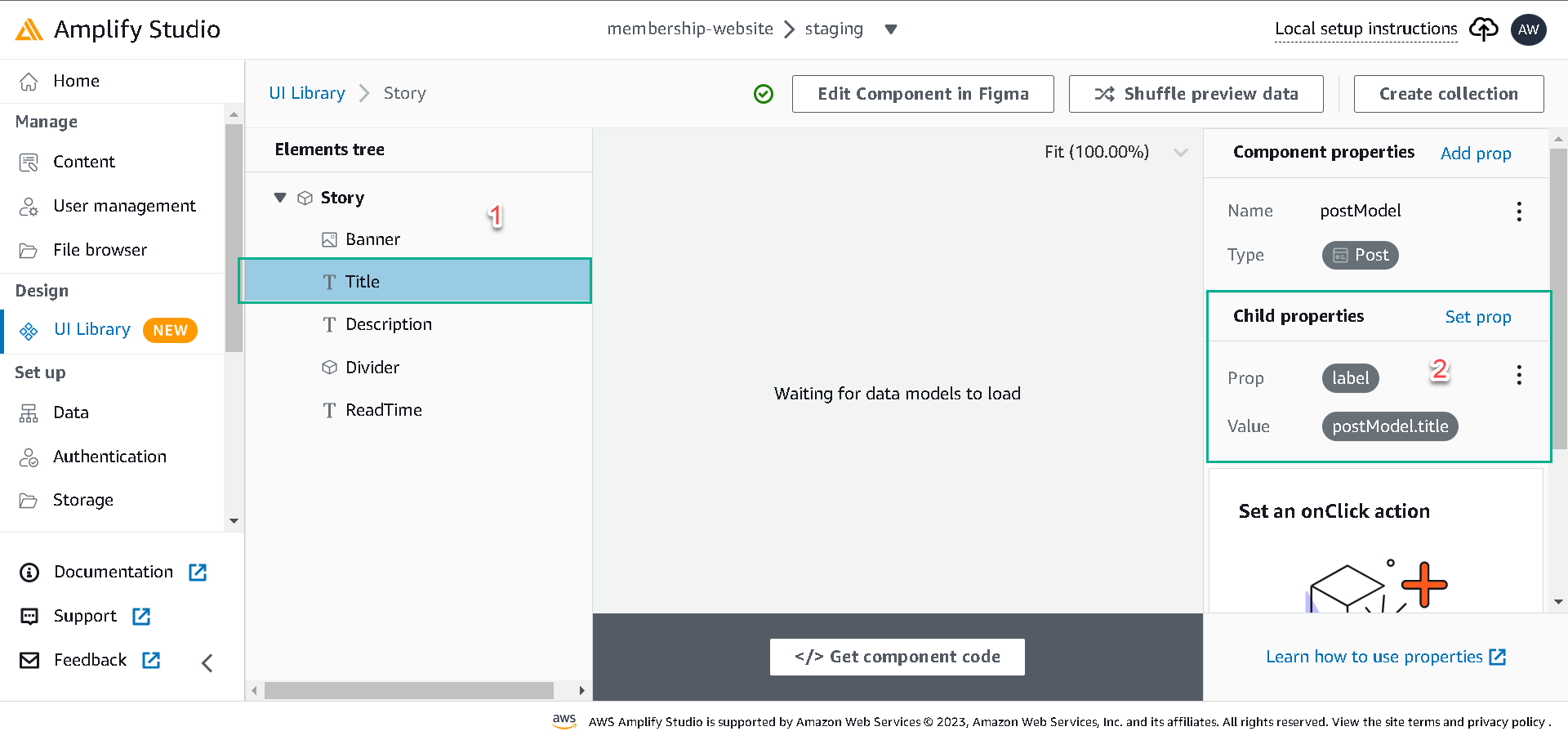
Now, select the Story Component, click the configure button, select the Component’s root, and click on Add prop. Create a top-level prop postModel and set it to the Post data model.
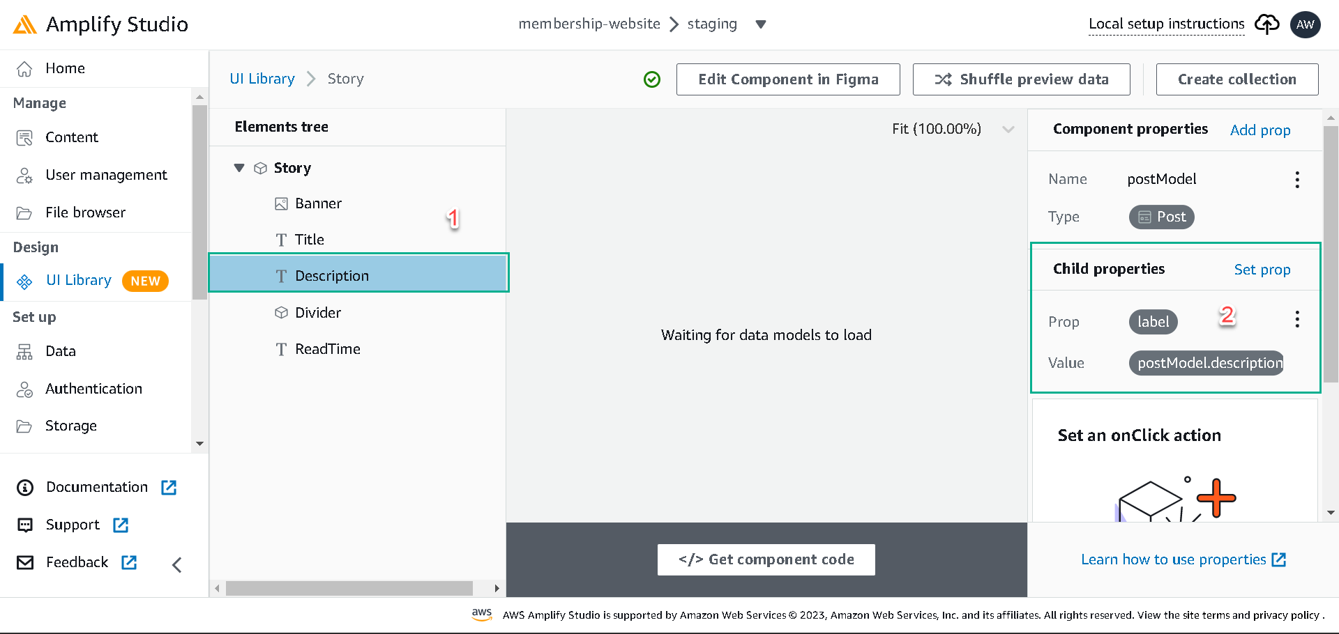
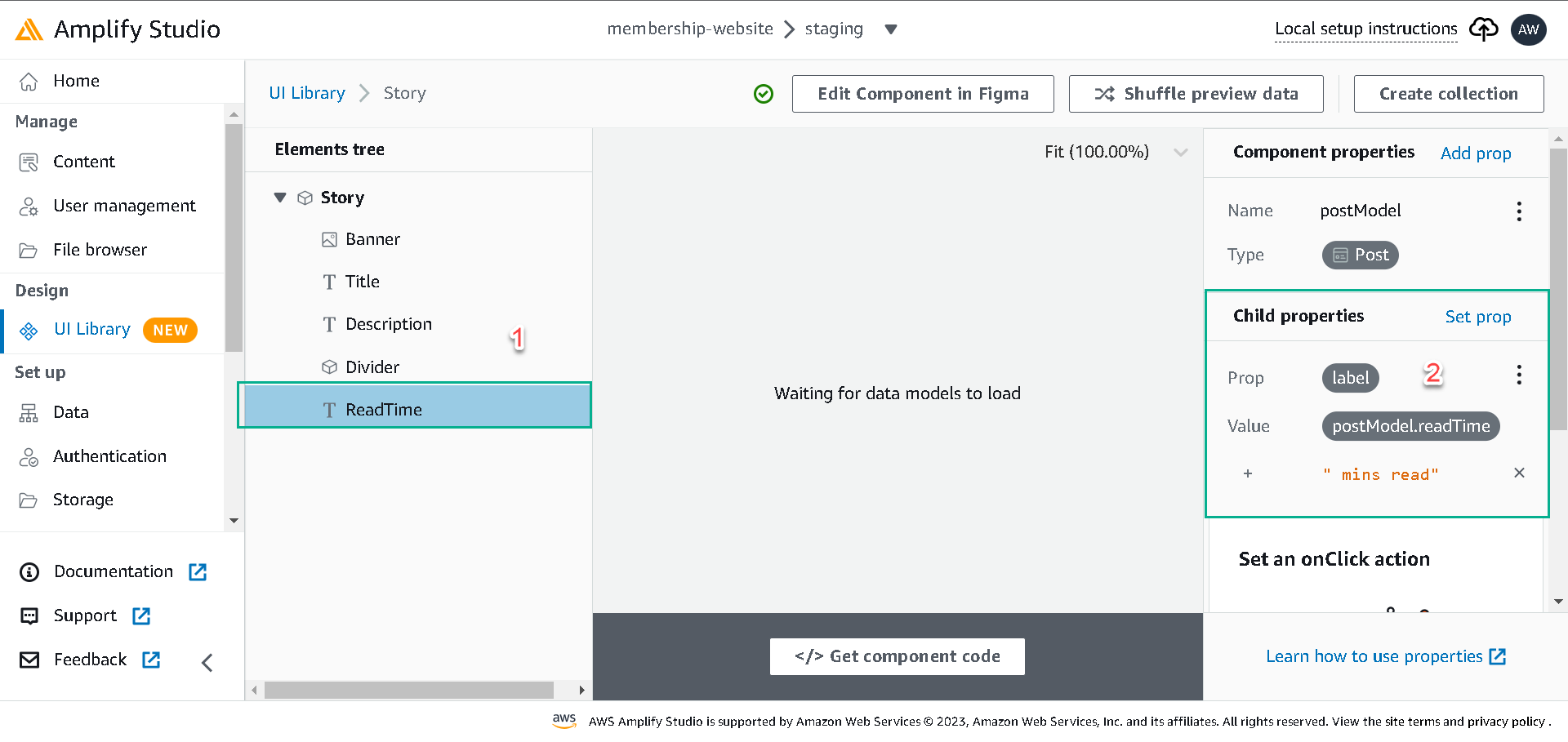
To bind postModel data to the Story Component elements, we’ll select:
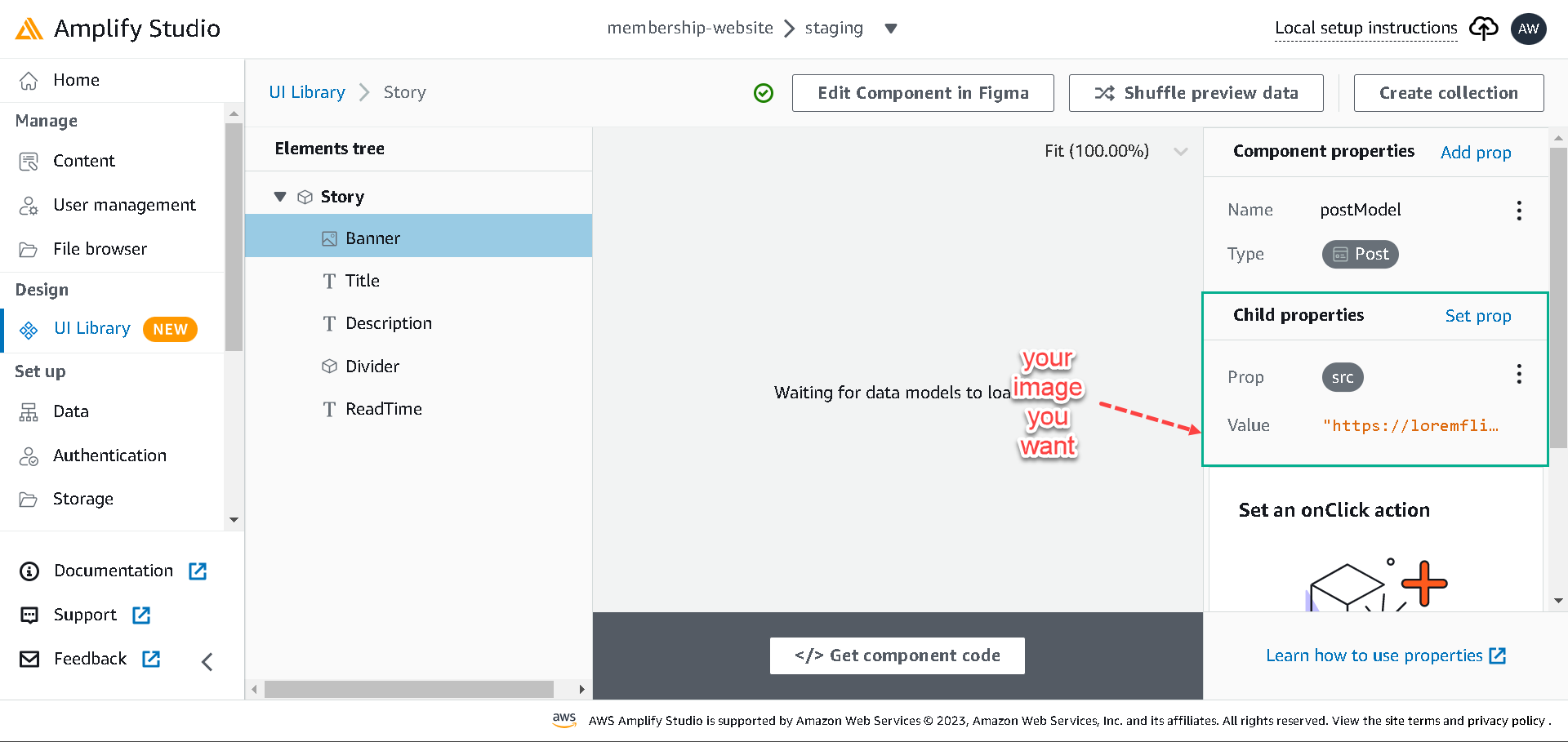
- Banner element, set its src prop to any static image.(You can choose
https://loremflickr.com/320/240?lock=212this image)
- Click on Set prop and set the label prop to postModel.title for the title element.
- Description element and set its text label prop to postModel.description.
- ReadTime element and set its label prop to postModel.readTime; also, we’ll concatenate a string
mins read..
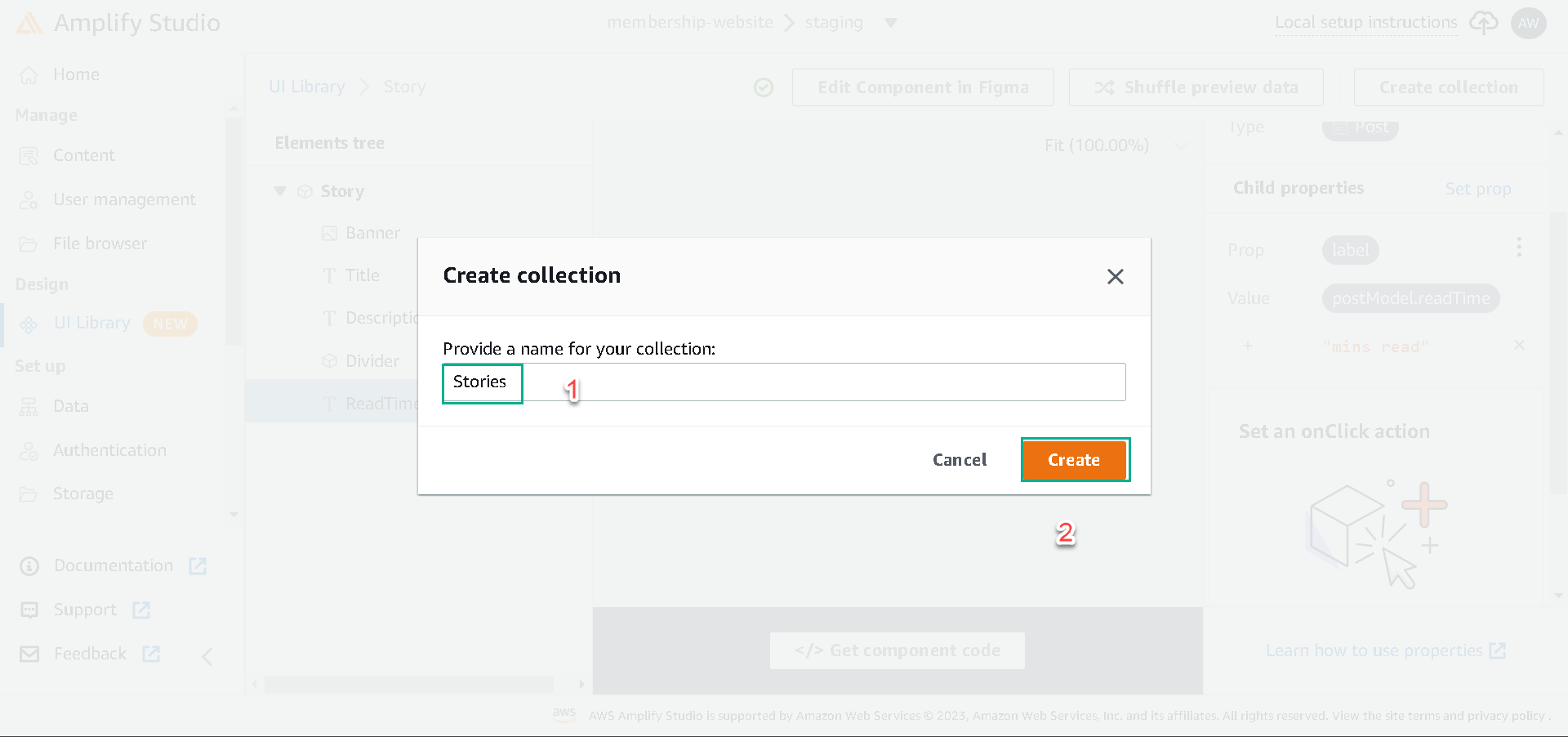
Next, click the Create collection button, name the collection Stories. In the collection page, set the display to Grid and the column to 3, then add a padding 10px round the box.
What’s Next?
In the next lesson, you’ll learn how to build the complete website using the components.