Create a Copy of the Design Project
Objectives
In this lab, you will learn how to:
- Kick off a design project using the Amplify template
- Theme the design to your taste
Creating the Project Design
We need to make a copy of this design file to get started. The design was created by cloning the official AWS Amplify UI template and adding a different theme.
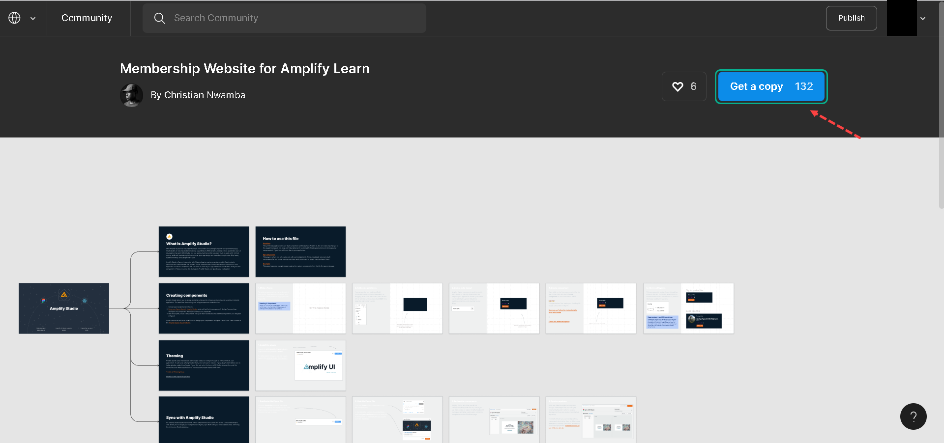
We can see the design was created, you can zoom to show clearly :
Even though we’ll use the customized design file for this project, let’s also see how to use the official UI library for future projects.
1.So, in the Figma community, search for AWS Amplify UI Kit and open the kit maintained by the AWS Amplify Team.
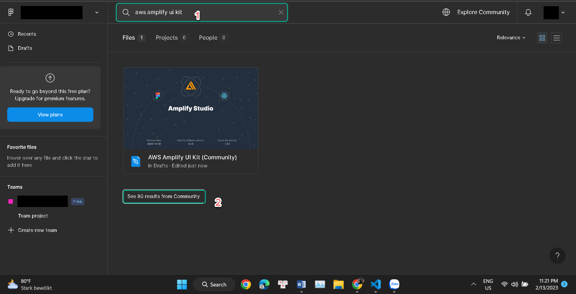
2.Choose figma name AWS Amplify UI Kit of AWS Amplify.
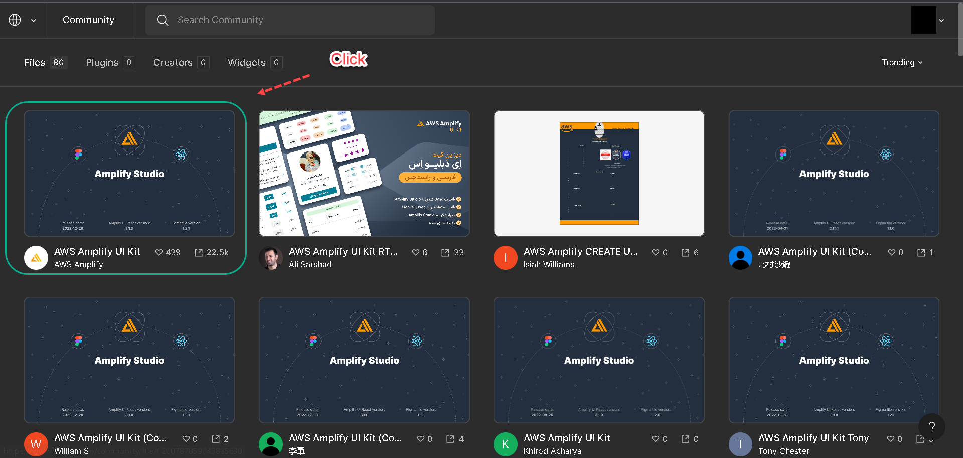
3.Click the Get a copy button to create a copy of the AWS Amplify UI project into our Figma account.
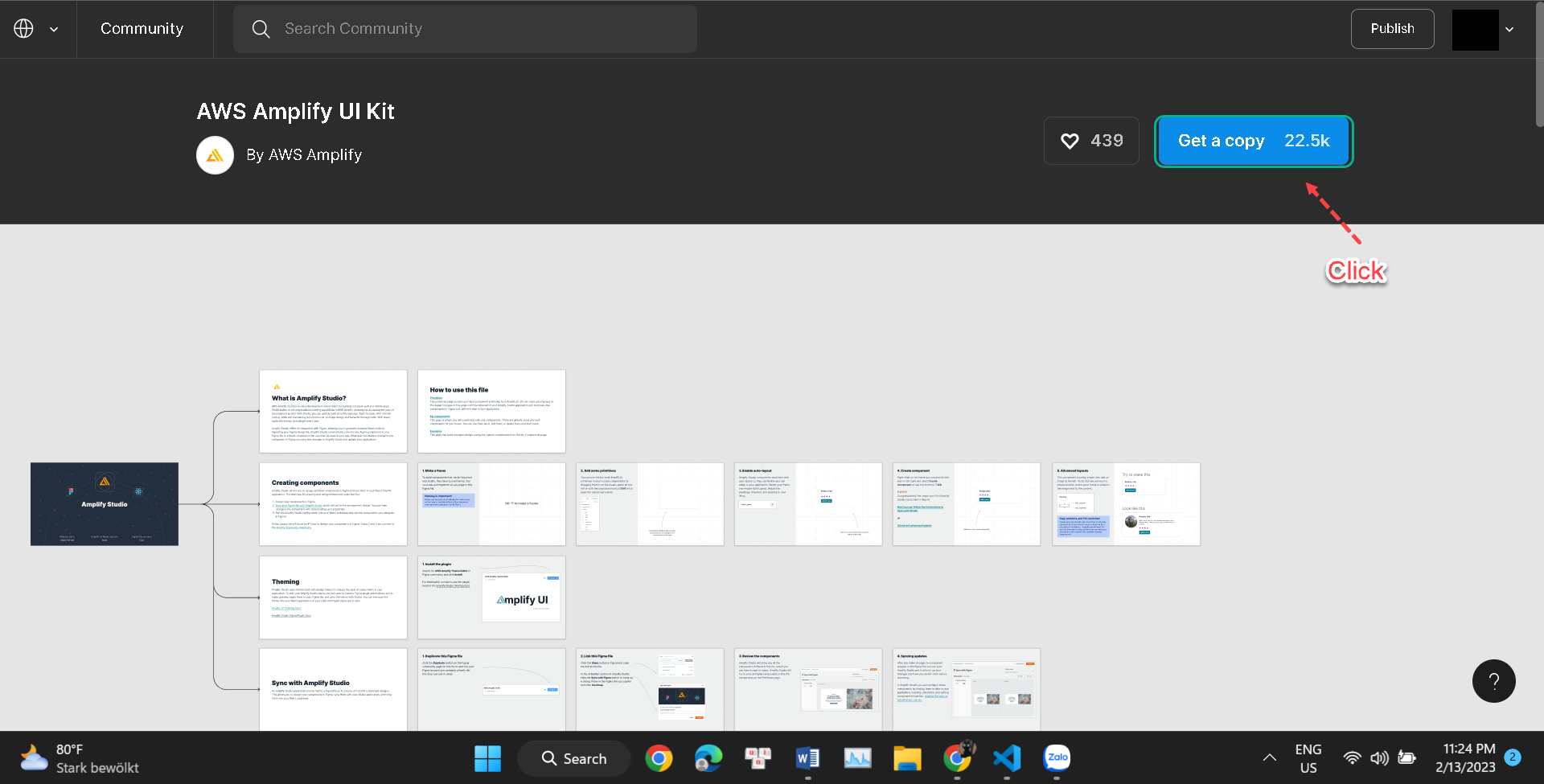
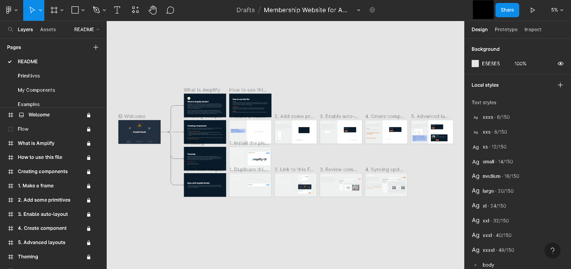
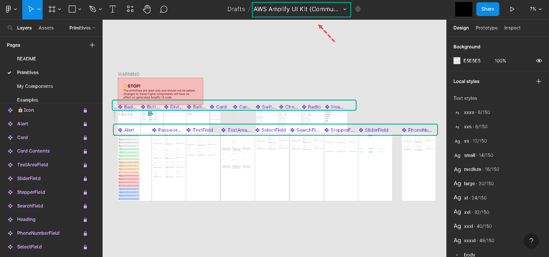
The AWS Amplify project contains the following pages:
-
A readme: describes the UI project.
-
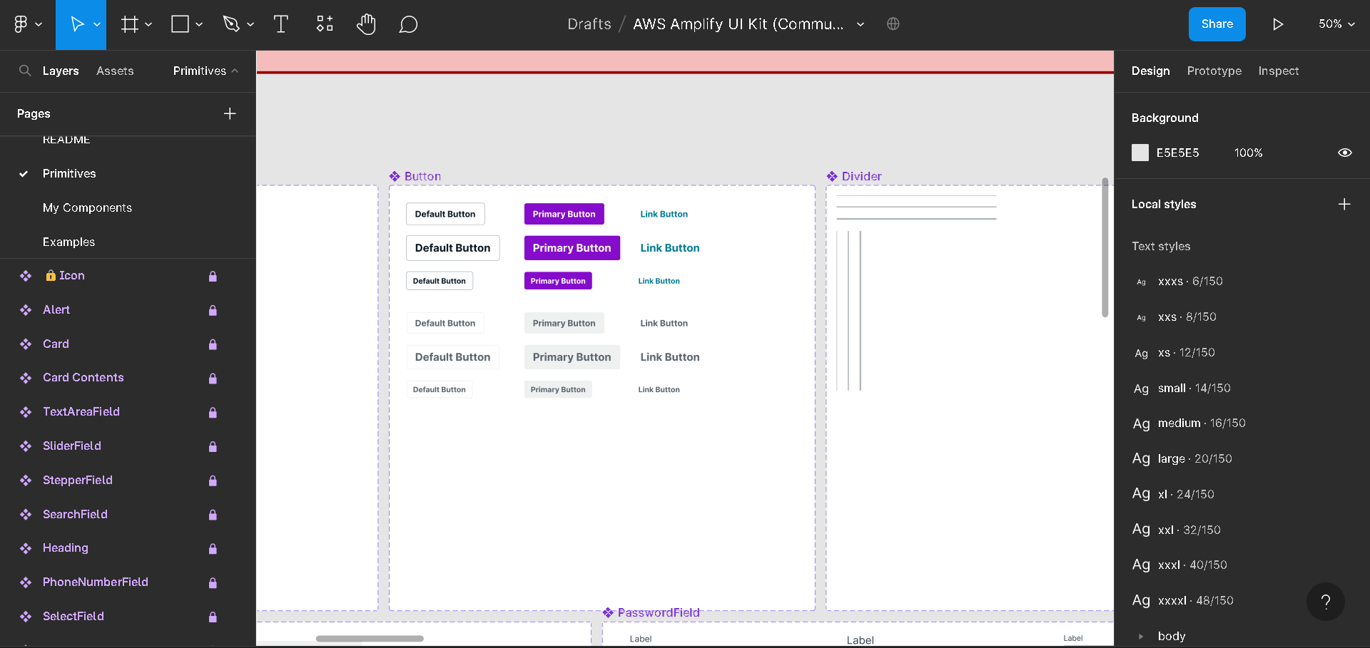
Primitives: like buttons and form controls that make up the component.
-
My Components: these are reusable components composed of primitives that we can drop on our website.
-
Examples: this page shows how to use the components.
Editing the Project design theme
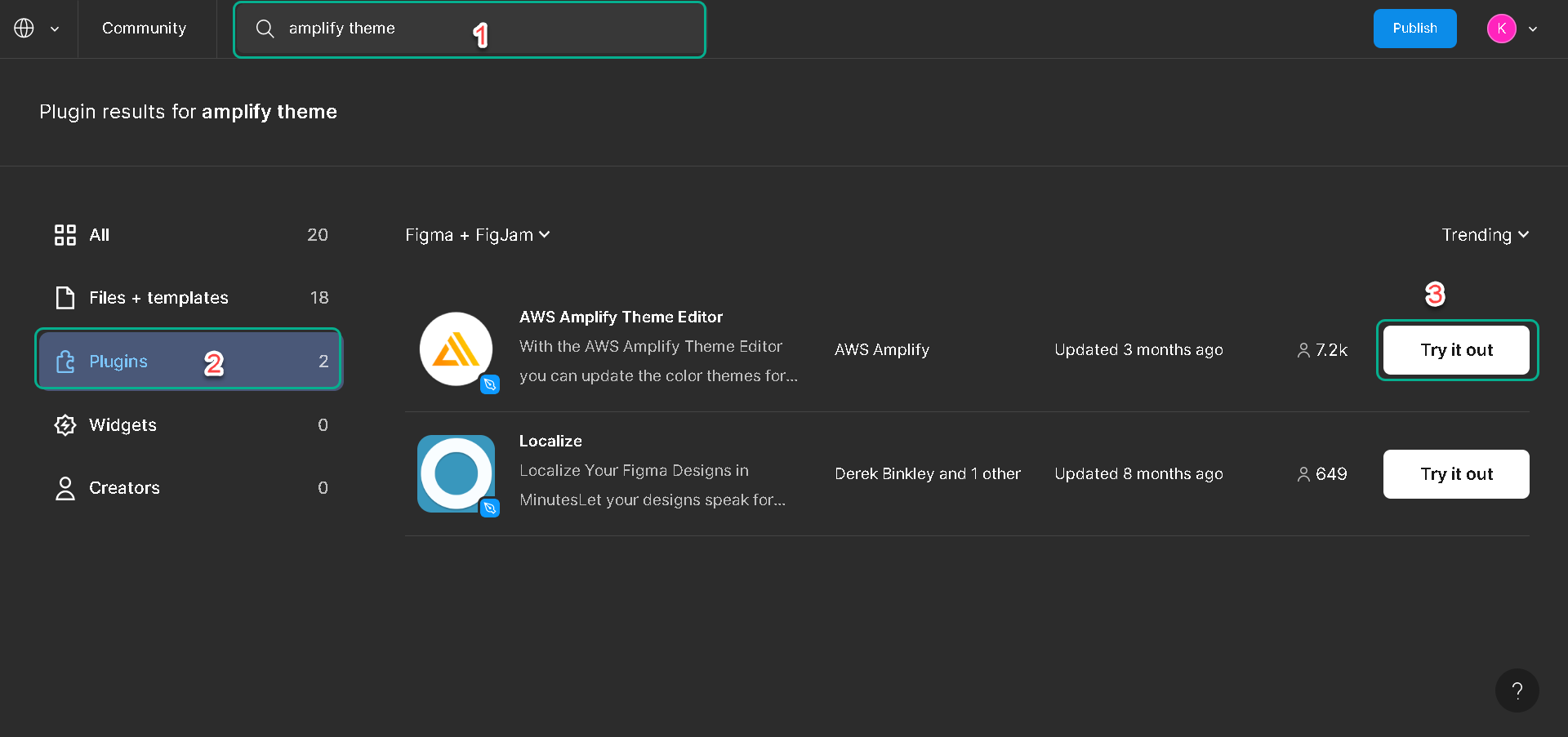
We can change the default theme of the official UI template; to do that, we need to install the AWS Amplify theme editor from the Figma community page.
1.Let’s search Amplify themefor the AWS Amplify and open it, click the plugin tab and click try it out it.
2.Click Primitives and Press the command + / keyboard keys to bring up the Figma command palette back to the Figma project.
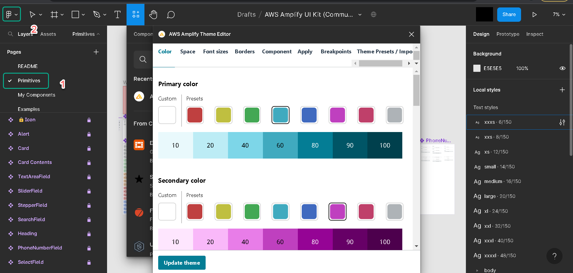
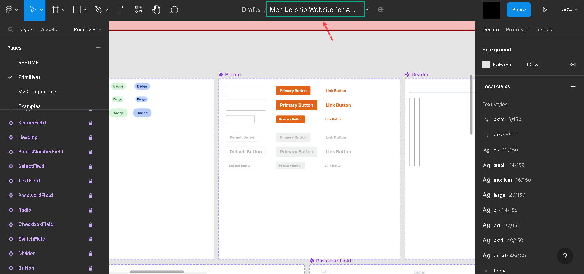
3.Let’s click Component for the AWS theme editor and open it, navigate to the components tab and search for button.primary. And set up the color (you can choose like picture). Then click Save.
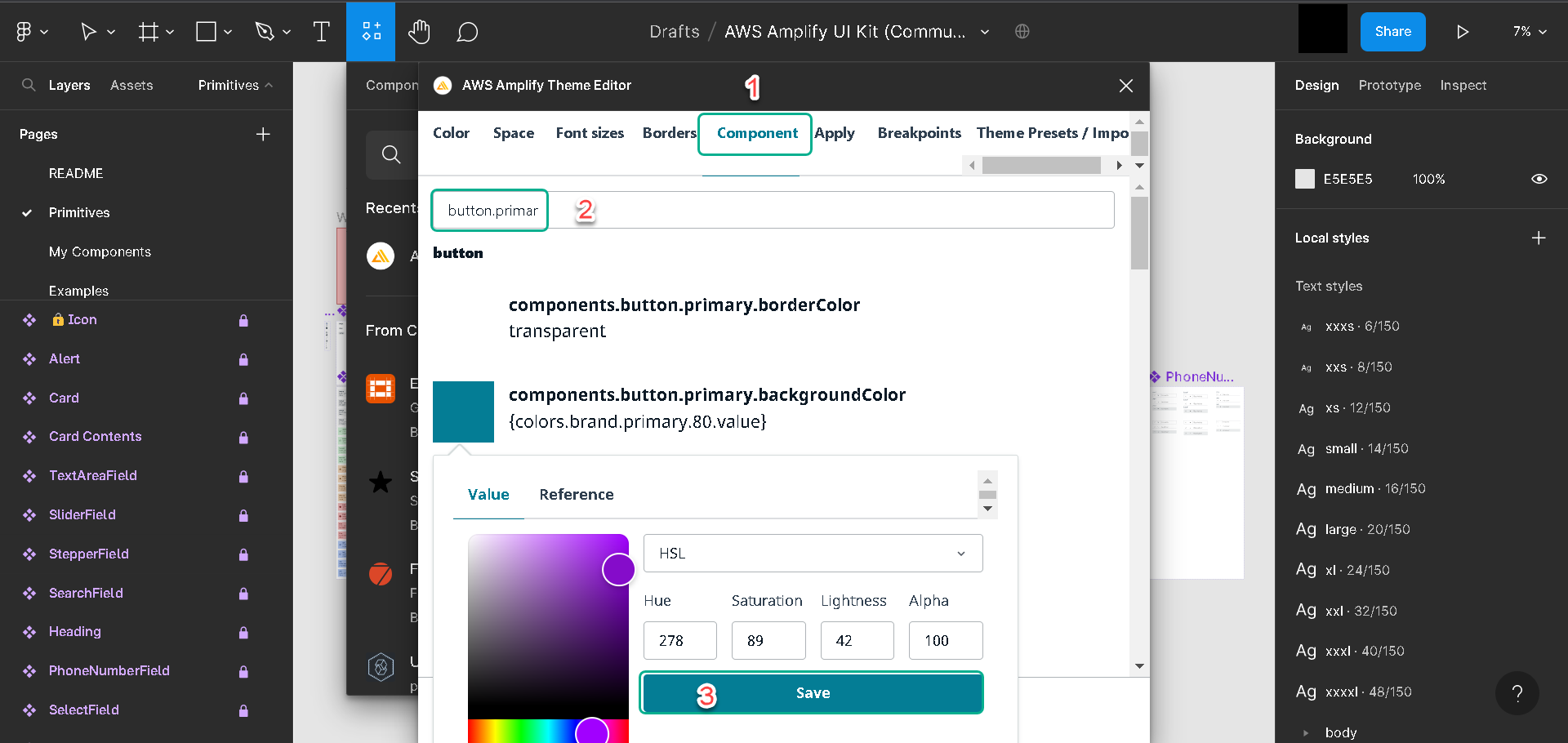
4.When save, we should see that we updated the color of the button on the primitives’ page.
Note
-
Amplify recommends that we don’t change the primitives directly; the components’ artboards are locked to prevent accidentally changing the Components.
-
The primitives have a one-to-one mapping with the AWS Amplify React UI library, which we’ll use when pulling the component into our react project. Changing the primitives will make it fall out of sync with the React UI library.
-
Amplify will always give us an object containing the themes we are using. We can then pass it to the React UI library to customize it.
On the components page, you should see that all button colors have been updated accordingly, the same thing on the example page
The Design We’ll Use
Instead of Official Amplify UI Kit in this project, we’ll use an already customized one that suits our membership website. The following is what was edited:
- On the Primitives page - the button color was changed to orange and the background color to dark blue, etc.
- The Components page - utilizes the customized theme and creates the following components:
-
The Hero component.
-
The testimony component.
-
The story component
-
The Nav Component and the Footer component.
- On the Examples page - a complete website was built using the components. The website includes a landing page and a paywall-protected page.
What’s Next?
In the next lesson, you will learn how to setup an Amplify project.